CATEGORIES
Thesis
Product Design
UX/UI
Mobile App
ROLES
UX Researcher
Interaction Designer
Visual Designer
TOOLS
Figma (FigJam, Figma Design)
Mapbox
Google Forms
TIMELINE
September 2025 - April 2026
(8 months)
TEAM
Individual
Context
For many Gen Z commuters in the GTA, the hardest part of taking transit isn't the commute itself; it's the relentless uncertainty that comes with it. Standing on a platform, wondering if you're in the right place. Cross-referencing different apps or websites because you don't fully trust any of them. Arriving somewhere, already mentally exhausted. This project set out to understand why that happens and design something that actually helps, not by making transit faster, but by making it feel less like something you have to survive.
Transit apps get you from A to B, but ignore everything you feel in between.
Public transit in Canada is built for efficiency…not for the people riding it. Apps like Google Maps, Citymapper, Transit, and the GO Transit app/websites focus entirely on logistics: routes, schedules, and arrival times. None of them address the emotional experience of the journey. None of them tell you you're okay.
It turns out, accurate data is NOT the same thing as feeling in control.

What the data shows
44.1 mins
Average public transit commute. The longest of any mode of transportation in Canada (Statistics Canada, 2025)
ZERO
Existing apps that address emotional comfort or uncertainty during the transit journey
3+ apps
What most commuters use simultaneously, because no single source can be trusted
But...what if the journey felt different?
How might we design a transit experience that empowers commuters to feel in control, calmer, and mentally supported throughout their journey?
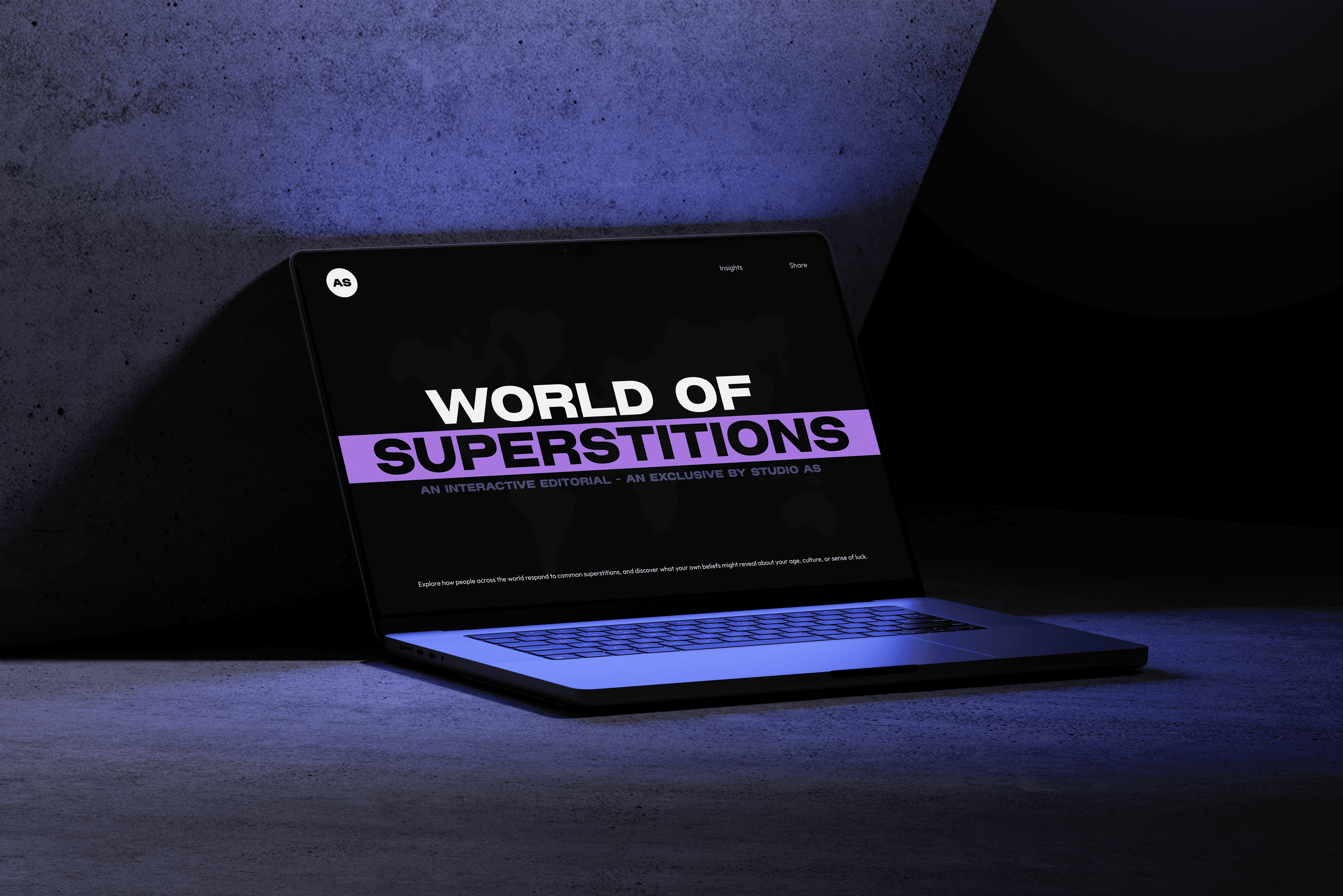
Introducing HOPON: a reassurance first navigation app for GTA transit commuters.
Not just another transit app. HOPON is built around the idea that confidence during commuting doesn't come from better data. It comes from feeling guided, seen, and supported at every step of the journey.
By combining photo-based navigation, the HOP virtual assistant, community-powered transit updates, accessible safety feature, and a transit rewards system, HOPON supports riders beyond simple route planning.
Every feature is designed to reduce uncertainty, encourage independence, and create a more reassuring public transit experience from start to finish.
DISCOVER
Starting with a broad question: what does commuting actually do to people?
I started this project with a wide lens, not on public transit apps, but on transit people. I wanted to understand the mental and emotional weight of commuting before jumping to solutions. This meant reviewing the data, reading the literature, listening to what commuters were already saying online, and gaining insights through surveys.
Understanding the problem before reaching for a solution.
Public transit users experience the longest commutes of any mode of transportation, averaging over 44 minutes per trip. From 2011 to 2021, that number barely moved. The proportion of transit commuters has grown for four straight years, yet the experience itself remains unchanged. (Statistics Canada, 2025)
Studies show longer commutes correlate directly with higher cortisol levels, burnout, and poorer mental health outcomes. When stress becomes chronic, as it does for daily riders, the body's stress regulation systems become overactive. A well-timed digital intervention during the journey could meaningfully interrupt that cycle. (Burtscher et al., Neuroscience & Biobehavioral Reviews, 2022 · Cleveland Clinic, 2025)
The tools exist. The experience doesn't.


To understand what that perspective should be, I needed to hear directly from the people living it.
A survey of 14 GTA commuters confirmed what the research suggested, and sharpened it. The primary stressor wasn't delay or distance.
Commuters weren't struggling because transit was slow. They were struggling because they were never quite sure they were doing it right. This single finding reframed the entire design question and pointed directly toward what needed to be built.
10 out of 14
Respondents identified unpredictability and lack of control as their primary sources of stress, not the length of the commute or overcrowding.
DEFINE
Getting in front of real commuters and having my assumptions challenged.
With a clear direction established, the next step was primary research with real transit users. I conducted semi-structured interviews with 11 GTA transit users across two rounds, running card-sorting activities and concept evaluations to pressure-test early ideas. Results were synthesized through thematic analysis, and affinity mapping.
I wanted to validate the research's findings. More importantly, I wanted to find out where I was wrong.
Where my key assumptions fell short
The first round of interviews revealed something immediately: the mental toll of commuting wasn’t primarily emotional; it was cognitive. The constant effort of managing timing, transfers, and upcoming stops was draining the mental energy commuters needed for everything else. One participant described their ideal commute as simply being able to “turn off my brain.”
Going into the interviews, I assumed users would want a fully guided, all-in-one assistant that tells them exactly what to do and when to do it. Every single participant rejected this idea. Not some, but all five.
Instead, users wanted three specific needs met:
clear autonomy to solve navigation issues themselves
a reliable system they can trust when needed
a background assistant that only intervenes upon request, offering support as a last resort.
Another assumption that fell apart: I had expected tools like breathing exercises, ambient sounds, and mindfulness prompts to be the app's core value. However, participants ranked these lowest and instead prioritized safety, real-time situational awareness, and community-generated updates. This revealed that users value practical support over wellness features.
With that realization about user priorities, everything shifted. HOPON would not be a wellness companion, but a confidence-building navigation system.
"I would be too overwhelmed if everything was together." - Interview participant, on the idea of an all-in-one guided assistant.


Through low-fidelity concept testing, navigation emerged as the top priority.
A concept evaluation using a low-fidelity prototype confirmed that the navigation feature was the clear priority. It was ranked first by all participants once it was introduced as a secondary assistant rather than an all-controlling guide.
To define the direction of the solution, I began with quick sketches to explore early ideas, which then evolved into a low-fidelity prototype for concept testing.


To revalidate my findings from the past four months, I conducted a second round of semi-structured user interviews.
To analyze the results, I used affinity mapping, which informed four core insights and guided the final design decisions.


4 CORE INSIGHTS & 4 DESIGN PRINCIPLES
Uncertainty is the trigger. Reassurance is the solution.
Design Principle: Build continuous, proactive reassurance into the navigation itself, not as an add-on, but as a core feature. Accurate data isn't enough. The system needs to say you're okay.
"If the app itself gives me that reassurance like, 'oh, you're on the right bus, you're in the right direction'... I would be relieved and more relaxed." - Interview Participant
Nobody trusts a single source. The problem is fragmentation.
Design Principle: Replace fragmentation with triangulation. Give users visual, text, and spatial confirmation in one unified place. The image feature was born directly from this insight.
"I sometimes feel lost and frustrated... I'm not familiar with the structure of the buildings here. Taking a photo and showing where I should go? It would be really helpful." - Interview Participant
Safety isn't a feature. It's the baseline.
Design Principle: A discreet, always-visible safety button on every screen. Not buried in a navbar. Present as a silent anchor across the entire experience.
"What often stresses me out the most is coming home late." -Interview Participant
Motion sickness is an overlooked accessibility gap.
Design direction: Design HOPON for motion sickness from the ground up. Muted palette. Reduced animation. Low visual density. Specific typeface for faster reading in motion.
"I can't look at my phone for too long." or "I can't use it for long term, have to keep it under a minute" or "I get super motion sick in the bus." - Interview Participants
So, who are we designing for?
Gen Z public transit users in the GTA


What kind of journey are they taking?
Ruth Davis
Ruth has six stages from trip planning to arriving at work: her tasks, emotional state, and HOPON's intervention opportunities at each step. The emotional curve drops sharpest at station entry and boarding, where she has no active confirmation and doubt peaks.
Dev Verma
Dev's anxiety is front-loaded into the planning stage. His journey depends on whether he can make it through the trip without looking at his phone more than a handful of times.
Both maps pointed to the same moment: transitions are where HOPON needs to be most present.


DEVELOP
Before the new concept was developed, HOPON needed an information architecture, which was made using a site map.

With the structure defined, the next step was mapping exactly how a user would move through it, from opening the app to completing a journey.


Translating research into a real product, from final concept to final design system.
After iterating from a low-fidelity prototype, the refined concept was tested with 5 participants to validate three specific elements: the assistant prompts, how community delay information was surfaced on the navigation screen, and the landmark-based guidance.
After analyzing the results using affinity mapping (located at the bottom), what came back confirmed all three were on the right track. Participants responded positively to the reassurance tone of the prompts, trusted community-sourced delay updates over automated schedules, and found landmark references more grounding than abstract map directions. The concept was officially solid and ready to build.


Created a research mood board & visual direction for HOPON, before moving forward to the second round of mid-fidelity.
The moodboard phase was grounded in three questions: What does motion sickness-friendly UI actually look like? What's the emotional tone of an app designed to feel reassuring rather than clinical? And how do you build a transit app that feels like a real product?
Research into WCAG accessibility standards guided the colour exploration, specifically which palettes and typographic choices reduce visual discomfort for motion-sensitive users. The direction that came through was calm confidence: a dark base, selective use of colour, and legible easy to scan typography.


HOPON - Visual Language Development


Content Design
Before building the prototype, the content for every screen was defined: labels, button text, HOP assistant prompts, community page, rewards page, and onboarding language. This kept the focus during prototyping on design decisions rather than content. It also ensured that HOP's tone remained consistent throughout the experience: proactive and warm. Human, not robotic.

Iterating on the mid-fidelity prototype and conducting first round of usability testing
The second prototype incorporated everything from previous round of concept testing. Colour was applied selectively, used within the navigation system to differentiate transit modes and map locations, and kept in black and white everywhere else to reduce visual load.
To maintain focus on evaluating the core navigation experience (image and safety feature included), the community page and rewards system were described verbally rather than fully prototyped during testing. With these changes in place, this version underwent usability testing with 5 participants who were tasked with navigating from Sheridan College to Union Station.

Results were synthesized through affinity mapping across six themes.
Image feature was the MOST liked feature.
Every participant praised it: one called it "1000% helpful," and another said it was their favourite feature because it prevents the trial-and-error of opening the wrong doors at complex stations. Participants mentioned that it was especially valuable for visual learners and for international students unfamiliar with local building structures, and that it was significantly more useful than Google Street View on mobile.
"It gives me a lot of reassurance to be like, okay, if this is where it's telling me to go, I can look up from my phone to see, okay, I know I'm at the right spot." - Testing Participant
HOP's tone landed exactly as intended.
Participants described the assistant's prompts as giving "human comfort" rather than sounding robotic. The landmark-based guidance made the reassurance feel grounded in physical reality.
"It's very different from the GO station ones, which sound very robotic. With your app, it gave more of a human comfort." - Testing Participant
Community updates were trusted immediately.
Participants said they would trust rider-reported delays over automated schedule data, particularly for unreliable lines like the TTC.
"It's based on the rider's inputs. So if the ride is cancelled, that's more accurate than just a schedule-based input from Google Maps. So I would trust it more." - Testing Participant
But what needed iteration?
HOP prompts could feel repetitive on familiar routes. Allow users to reduce frequency or mute on saved routes.
Prompts needed to stay on screen longer, with a voiceover option for when users aren't looking at their phone.
Photos in the Image feature should be captured from the user's perspective at the bus stop, facing toward the station, rather than from inside the station looking out.
Finally, the high-fidelity prototype - where every design decision came together.
Everything learned from Round 1 testing was translated into a full, cohesive product. The complete visual system was applied consistently across all screens. The community and rewards pages were fully designed. Onboarding was built out.
*Note: Used Mapbox to make a custom map (used HOPON colours, typography, etc), and all icons used in this prototype are from thenounproject.com


DELIVER : FINAL DESIGN
A step-by-step onboarding flow that introduces key features and permissions
It also walks riders through account creation and avatar selection, and offers a vehicle motion-cue shortcut setting to help reduce motion sickness.
A navigation system built around reassurance - HOP (Virtual Assistant)
A proactive chat assistant that gives human-toned prompts throughout your journey. A chatbot that also acts as a guide. "You're on the right track! Head towards the Burger King across the bus stop."
Photo-based navigation for extra reassurance
Real photos of station entrances and transfer points, overlaid with directional arrows and step-by-step guidance.
Built-in safety feature
A discreet, always-accessible button available on every screen. No hunting through menus in a stressful moment. Designed to feel like a quiet anchor, there when you need it.
Stay updated through community
Real-time delay reports from other riders. Human-verified, faster than automated schedules, and trusted more than any official source.
Get rewarded for your journey!
Points (HOPS) earned for every completed trip, redeemable for real-time rewards, including transit fares and partner brands. Making your journey more rewarding.
Finally, what did I learn about myself in this 8-month-long journey?
Trusting the exploration process to find the right problem
At the beginning, I struggled to define a problem space and felt pressure to choose the "right" topic for the next 8 months. Through reflection, observation, and conversation, I realized my strongest ideas come from exploration rather than immediate inspiration. This process led me to focus on public transit, a challenge I had experienced and knew many others gen z faced.
As the project evolved, I noticed a recurring tendency to think too broadly. Learning to narrow the scope and validate decisions through research became my essential skills that shaped the final solution.
Learning that sustainable progress matters as much as deadlines
Pushing through challenges without breaks often led to burnout and reduced productivity. Moving forward, I want to manage my workload more intentionally, create healthier routines, and give myself space to step back when needed.
Most importantly, I learned the value of trusting the design process. Regular feedback, research validation, and iterative testing helped me build confidence in my decisions and reminded me that strong solutions are developed through continuous learning and refinement.
Navigating burnout by prioritizing core navigation testing
My biggest challenge was maintaining momentum during the project's final stages. After months of research, ideation, and iteration, I experienced burnout while balancing academic and personal responsibilities. I had to make strategic decisions about where I can focus my efforts.
Although I was unable to conduct usability testing on every high-fidelity feature, I prioritized testing the core navigation experience through a mid-fidelity prototype. This experience reinforced the importance of adapting to constraints while ensuring the most critical aspects of the user experience remained validated.
Any next steps?
Conduct additional usability testing rounds
Second round of usability testing on the high-fidelity prototype is needed to validate the added features, specifically the community page interaction, the rewards flow, and the onboarding experience. Testing should include participants who experience motion sickness to directly validate the accessibility decisions built into the visual system of HOPON.
Expand and complete all core features
The community page and rewards system were designed and partially tested, but not fully built out in the final iteration. Both are essential to HOPON's value proposition: the community page creates trust, and the rewards system creates retention. These should be the first priority in the next development phase.
Refine motion sickness accessibility
Current design addresses motion sickness through typographic choices, a muted colour palette, reduced animation, and a shortcut to iOS's built-in motion sensitivity setting in the onboarding process. The next iteration should go further, by building out a dedicated accessibility mode within the app that reduces visual density even more, and shows extra haptic feedback options.