
CATEGORIES
Data Visualization
UI Design
UX Research
ROLES
UX/UI Designer
Data Visualization Designer
TOOLS
Tableau, Figma
TIMELINE
March - April 2025
TEAM
Individual
Context
World of Superstitions is an interactive editorial website that explores how cultural beliefs and superstitions influence everyday decision-making. Through data visualizations and narrative storytelling, users can uncover behavioural patterns and reflect on how these beliefs may shape their choices.
Designing as a Solo Designer
As the sole designer, I led the end-to-end design process — from interpreting survey data to building the final interactive prototype.
Scope & Constraints
This 4-week project focuses on transforming a small survey dataset into a fictional interactive editorial platform. Without live user testing, the design leaned on clear storytelling and exploratory interaction to compensate for the dataset's limitations.
Data about cultural beliefs often lacks context and story
People often encounter data about beliefs and behaviours in the form of static charts or survey summaries. While these datasets may contain interesting insights, they rarely provide enough narrative context for audiences to interpret them meaningfully.
Without storytelling and exploration, cultural belief data can feel disconnected from real-life experiences.
This led me to ask myself...
How might we transform superstition-based data into an interactive editorial experience that helps users explore cultural beliefs and reflect on their own decision-making?
An interactive editorial that turns data into exploration
Users can explore:
Responses to superstition-based “Would You Rather” questions
Compare belief patterns across different demographics
Discover unexpected trends in how people make decisions
Reflect on how cultural beliefs may influence their own behaviour
*Supporting facts from credible sources are added throughout to add context and reinforce key insights.
DISCOVER
How did I collect the data?
The dataset was collected through a Google Forms survey, divided into three sections:
an introduction collecting demographic information
a core set of superstition-based "Would You Rather" questions
a closing reflection asking participants about their overall sense of luck or misfortune.
Each section formed the basis of its own chart and dataset, which were organized in Google Sheets before being visualized in Tableau.
Utilizing dynamic data
To visualize how the data moved through the project, I mapped out the full data pipeline, from survey creation to published visualization.
*For this project, the pipeline ends at Tableau, from there, visualizations were exported directly into Figma to build the interactive editorial experience.


DEFINE
BUT...who are we designing for?
Gen Z digital users exploring culture and behaviour through online content


Inspiration behind my design principles
My inspiration came from The New York Times Upshot feature "Can You Stop an Outbreak of a Contagious Disease?"
I was drawn to the way it blended interaction, narrative, and data into one seamless experience. From this, I identified five design principles to guide World of Superstitions:
Scroll-Based Storytelling
Clear, progressive narrative that guides users through insights as they scroll.
Blended Interaction & Narrative
Interactive elements, storytelling, and data work together seamlessly.
Accessible Visuals
Simple, clear visualizations that don't overwhelm users.
Reflective User Experience
Encourage users to pause and reflect on how the data relates to their own beliefs and choices, making the experience personal.
Visual Consistency
Maintain cohesive typography and colour choices across the product to build a unified, professional editorial feel.
So, HOW will users navigate the editorial?

DEVELOP
Colour Palette
Before jumping into the final design, I explored the colour palette to ensure it was both visually cohesive and accessible. I ran the main purple through a contrast checker, which flagged it as inaccessible against a dark background, so I swapped it for a lighter, softer shade that passed.
I repeated this process for the typographic colours as well, ensuring every element met accessibility standards before moving on to the high-fidelity design.
Typography
For both header and body, I chose sans-serif fonts to reflect the modern, editorial feel suited for a Gen Z audience. Greater Theory was selected as the display typeface: a bold, high-contrast all-caps font that pairs well with strong design colours. For body text, I used Outfit, a geometric sans-serif known for its clean lines and balanced structure.
GREATOR THEORY
ABCDEFGHIJKLMNOPQRSTUVXY
1234567890
Outfit
ABCDEFGHIJKLMNOPQRSTUVXYZ
abcdefghijklmnopqrstuvwxyz
1234567890
Iterating on the Hero Section
During this process, I refined the logo, moving away from "WS" (World of Superstitions) to a separate studio name, "AS", to give the editorial a more authentic, independent feel.


Introducing participant superstition levels through an interactive bar chart
This chart gives users a quick overview of superstition levels, setting the tone for the experience. It was exported from Tableau as an SVG into Figma, where colours, tooltips, filters, and a supporting hover fact were added.
Because Smart Animate did not perform as expected, hover overlays were used to simulate the bars updating in real time.


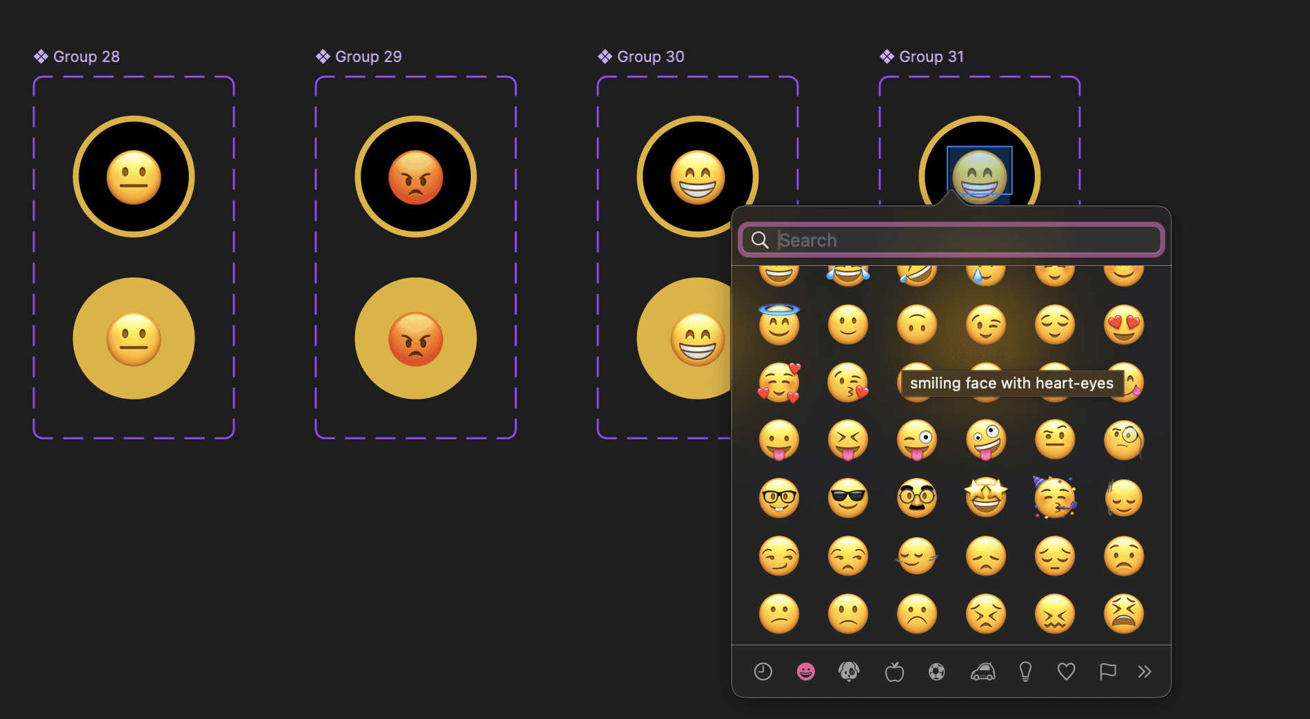
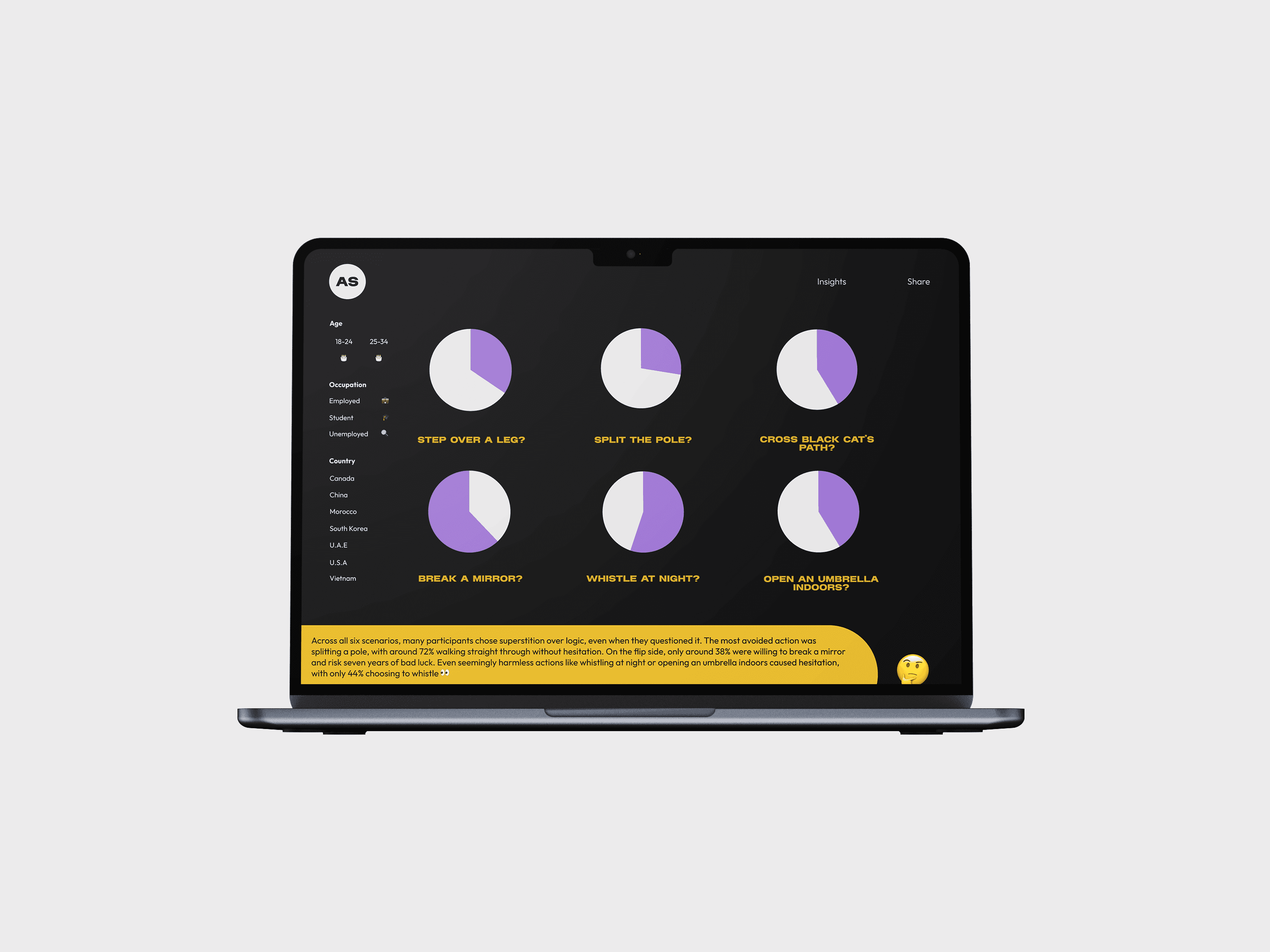
Exploring participant choices in "Would You Rather" questions through interactive pie charts
This chart highlights trends in participant choices, with filters that update the chart on hover, and a supporting fact that appears when hovering over the emoji.
While feedback suggested using bar charts for clarity, time constraints prevented the update, which I would revisit if given more time.


Adding a Follow Up Prompt
To enhance the experience, I added a reflective prompt immediately after the "Would You Rather" questions, encouraging users to consider how they would have responded.
This created a more personal connection to the data, shifting the experience from passive viewing to active reflection.

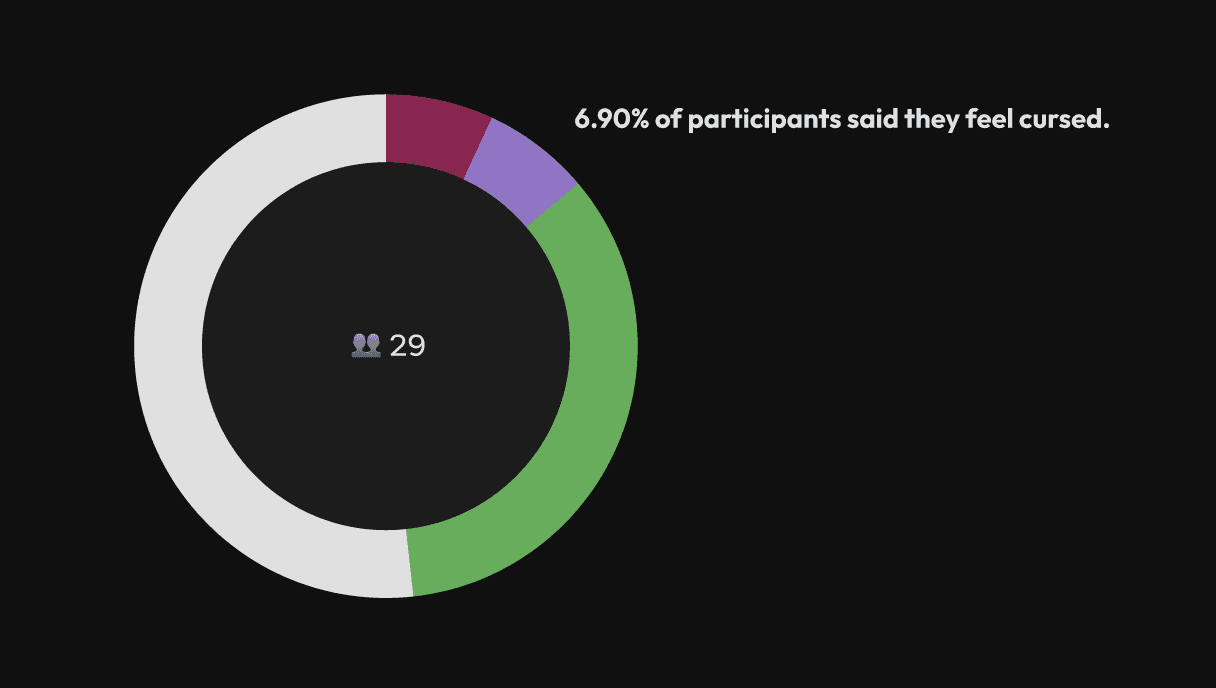
Encouraging users to reflect on whether they feel lucky, cursed, neutral, or unsure
I added an emoji filter to make the interaction playful and intuitive. Hovering over each emoji reveals how many participants selected that option, along with additional context and a supporting fact from an external source.


Closing the experience with a call-to-action that encourages reflection and sharing
To end the editorial, I added a CTA section (footer) giving users the chance to reflect on what they explored and share it with others.


DELIVER : FINAL DESIGN


Finally, what did I takeaway from this experience?
Tackling a New Challenge - Tableau
Learned to use an unfamiliar tool to create data visualizations. While it was initially more challenging than familiar design tools like Figma and Adobe, this experience strengthened my ability to work with dynamic data, and translate it into clear, engaging visuals.
Support Exploratory Learning
Focused on creating an experience where users can reflect and discover patterns themselves, avoiding oppressive conclusions or exaggeration.
Design With Purpose, Not Decoration
Minimized unnecessary visual enhancement, ensuring every element supported understanding, and did not distract from the data.
Present Data Responsibly
Designed visualizations to reflect opinions and behaviours rather than definitive facts, using clear labelling, consistent colours, and credible sources to maintain accuracy and trust.
Prioritize User Comprehension
Emphasize clarity and accessibility through clean layouts, strong colour contrast, and a friendly tone to accommodate different levels of chart literacy.
Any next steps?
Refining the Chart Choices
Moving forward, I would invest more time researching which chart types work best for different datasets. If I was given more time, I would replace the pie charts in Chart 2 with a more suitable chart type to improve clarity and better serve the data.