CATEGORIES
Graphic/Print Design
Training Materials Design
Internship
ROLE
Training Content Design Intern
TOOLS
Adobe Illustrator
Adobe InDesign
TIMELINE
July 2025 (1 month)
TEAM
Training Content Design Intern
National Product Training Manager
Director (Retail Experience Team)
Context
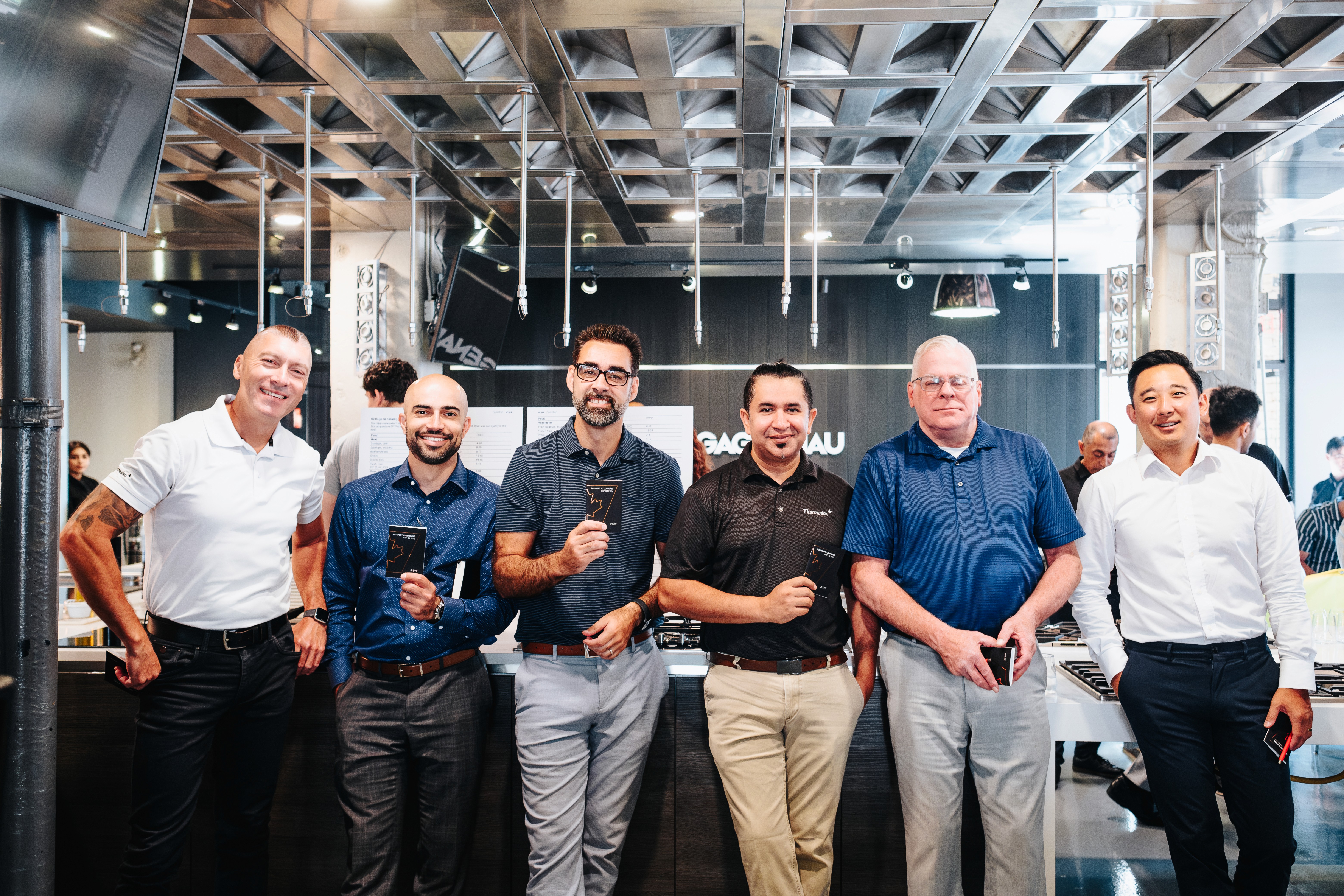
During my internship at BSH Home Appliances, I designed a passport-inspired training booklet for their QBP Q4 2025 Training Day, an internal event where employees travelled through the Toronto showroom and rotated across nine product training stations.
The booklet served as a hands-on workbook for employees to answer questions at each station. It was also a keepsake reflecting their journey through the day and included a tear-out raffle page for a prize draw at the end.
Goal
Design an engaging, functional training booklet to support employee learning across nine workshops.
Reflect the event's physical experience.
Unify three premium brand identities under one cohesive design.
Make participants feel appreciated and represented in their Canadian identity through a thoughtful, travel-inspired experience.
FINAL DESIGN
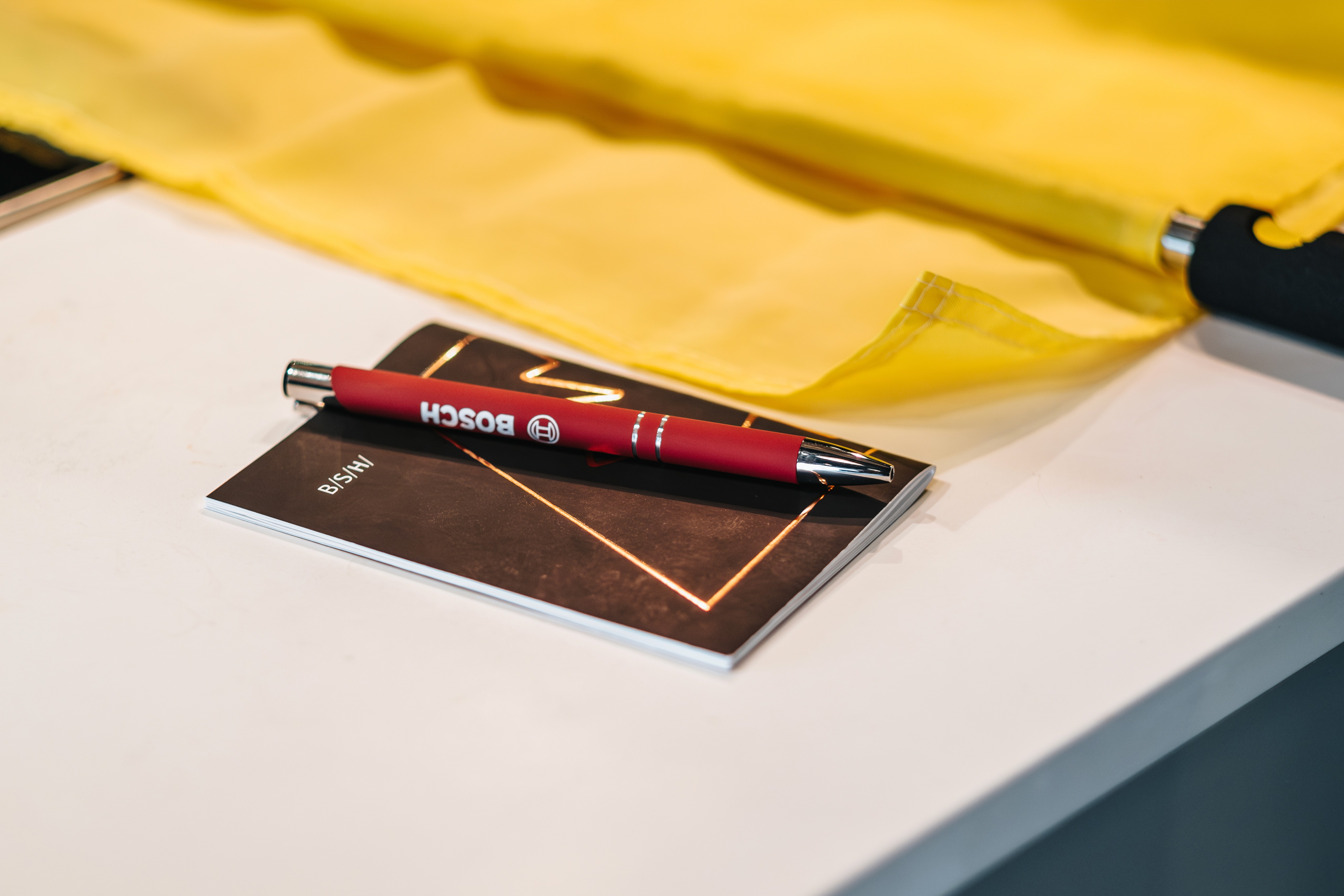
A soft-touch, velvet-laminated booklet featuring a copper foil maple leaf and BSH's iconic parallelogram outline at the center, heavily inspired by the Canadian passport.
*Permission was given by BSH to use the following photos from the QBP event.


The design incorporates BSH's brand colours, typography, and shape language. "Passport to Learning, QBP Q4 2025" is printed across the top, with the "B/S/H/" mark in each corner. Inside, 16 different pages guide employees through each station of their training journey.



PROCESS
Starting with quick sketches of the cover
With my supervisor's approval of the passport concept as the creative direction, I developed the booklet's visual identity from the ground up. To give my supervisor a clear idea of possible visual directions, I sketched a few cover concepts before developing the final design.

Developing the initial cover design (7 x 5 inches) in Illustrator
I presented the design to my supervisor for feedback on the layout, size, colours, and text placement, as the team had envisioned a red cover with gold or white accents for both the maple leaf and typography.


I also included bleed lines, crop marks, and an FPO (For Position Only) placeholder for the maple leaf, and added extra spacing in the centre of the maple leaf, so the top and bottom points would remain fully visible on either side of the spine. Since the final shape was still under review, this version allowed my supervisor to approve the overall layout while ensuring the file was print-ready.
Exploring a blue colour direction for the cover
After reviewing the initial design, I proposed replacing the red cover with the deep blue commonly associated with Canadian passports. This felt more fitting for the travel theme and created a less visually intense design. My supervisor agreed and asked me to explore the blue/navy direction further. At the same time, I began experimenting with a solid fill for the maple leaf.


Incorporating the BSH brand identity
During my first design review with the Director of the Retail Experience team, she suggested strengthening the BSH brand identity by incorporating the company's signature orange and the parallelogram shape used in its logo. Based on this feedback, I refined the design and created additional iterations to present at the final meeting.


Experimented with stroke weight and placement of the maple leaf and the parallelogram.


I also created an orange-and-white version based on this new visual direction.
Deciding on the final visual direction
During the final design critique, my supervisor and the director agreed that using orange as the primary cover colour felt too bold. Instead, they suggested incorporating it more subtly into the design. I proposed applying the orange to the parallelogram shape and the maple leaf to reinforce the BSH brand identity without overwhelming the cover.
My supervisor also suggested enhancing the printed piece by applying a copper/orange foil finish to the parallelogram and maple leaf and using a soft-touch velvet laminate for the cover. This combination added both visual contrast and a premium tactile quality. Together, these refinements established the final visual direction, which was later approved by the director.
*The inside page was designed as a plain white page to complete the other side of the cover.
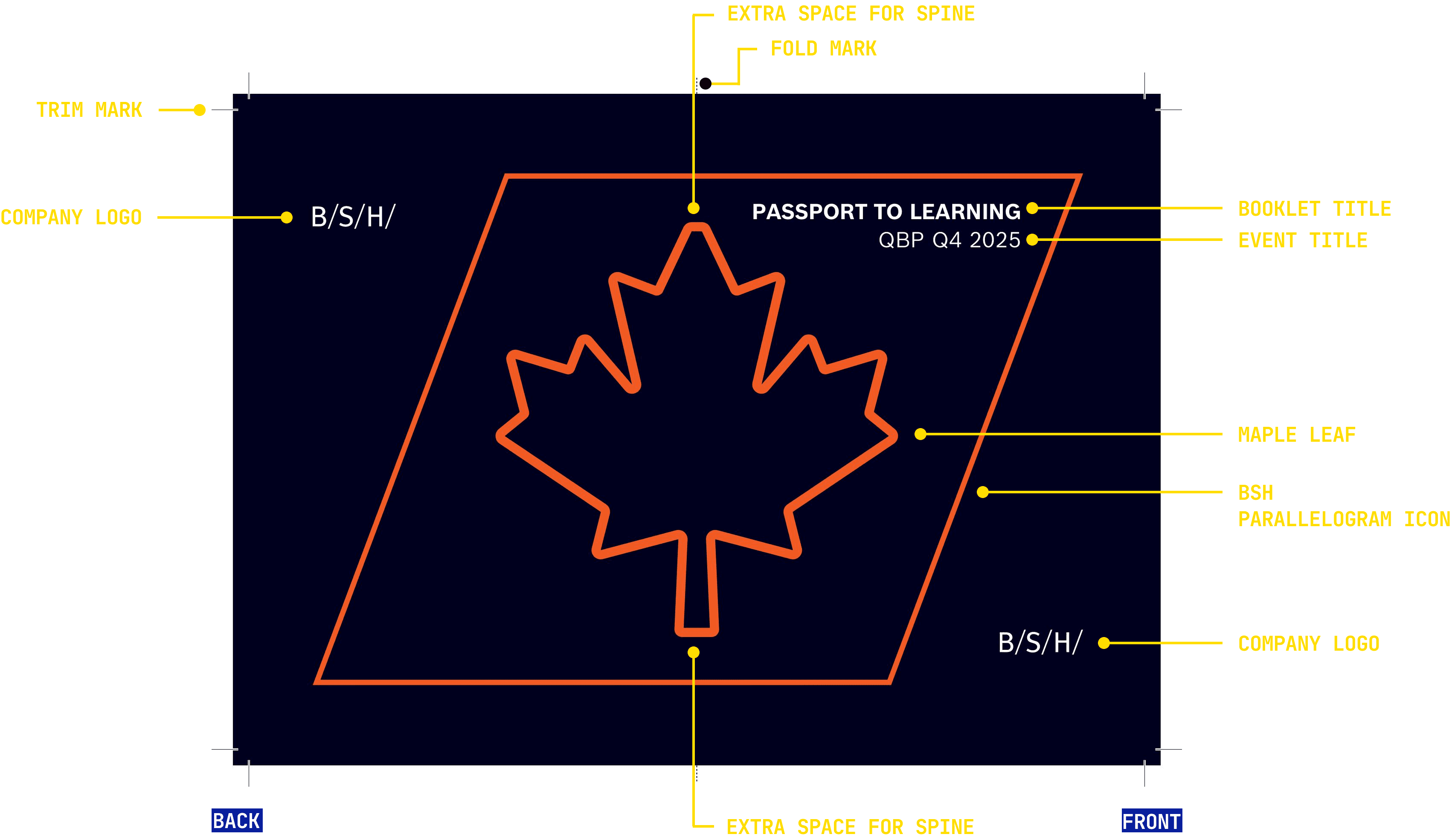
*Although the final booklet (cover and inside pages) size was 7 × 5 inches, an additional 0.25-inch bleed was added to all sides during the design process to ensure that no design elements were cut off during printing and trimming.
Additionally, I suggested matching the parallelogram's stroke width to the maple leaf's. However, my supervisor recommended keeping the parallelogram consistent with the original BSH icon, since it matches the BSH's icon width. They also preferred the maple leaf to have a thicker stroke than the shape itself, so it would stand out more prominently in the design.
Next, developing a consistent layout system across multiple brands
After finalizing the cover direction, I focused on creating a consistent layout system for the nine workshop pages, each representing a different product and brand. I developed a repeatable structure featuring an icon of the product (top right), a bold workshop title, product name, product pitch line (one thing to know), and a Q&A fill-in box to ensure the booklet remained functional as a workbook while maintaining a cohesive visual experience.
*Trim and fold marks were also added to the inside pages before printing.

To unify the pages across Bosch, Gaggenau, and Thermador, I used the Bosch typeface throughout, following the standard used in BSH training materials, and applied BSH's parent brand colour guidelines. Brand logos were rotated per page to preserve each brand's identity within the shared layout.
The pages were organized and numbered according to each workshop schedule and rotation order, allowing employees to move through the booklet seamlessly without flipping back and forth.
*Permission was given by BSH to share the following content from the booklet.
Additionally, these are the initial layout iterations I explored before refining them based on my supervisor's feedback and finalizing the inside page structure shown above.


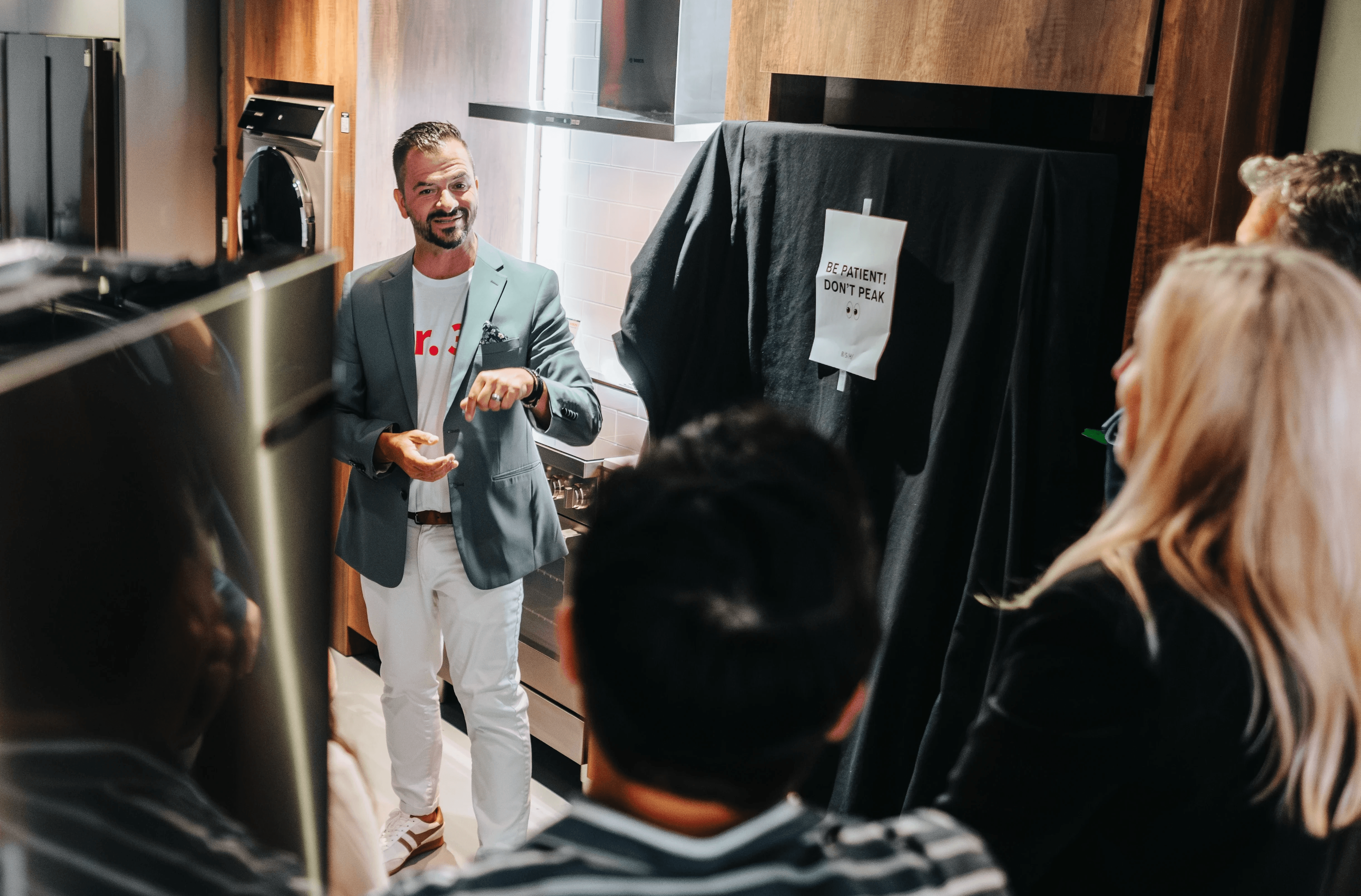
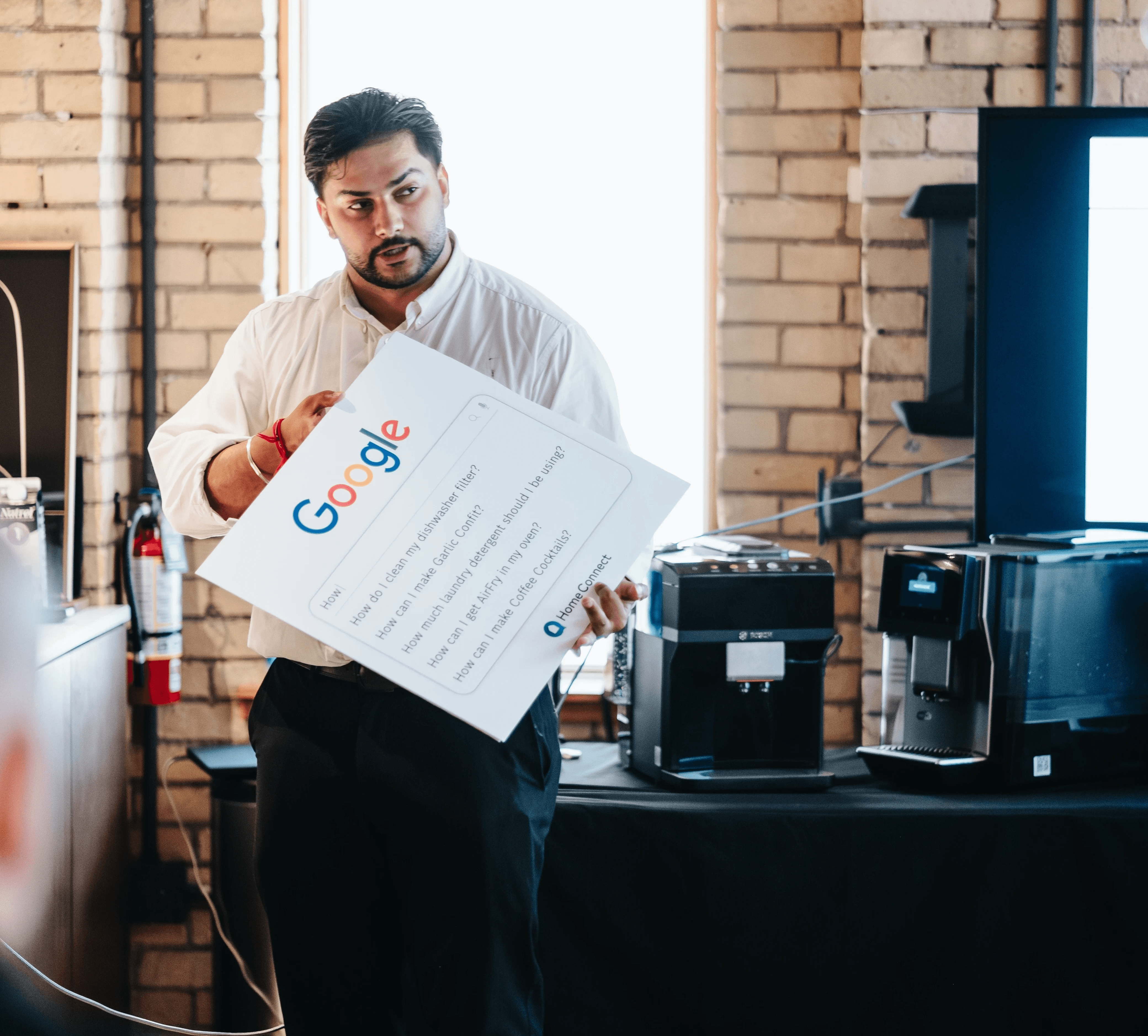
Alongside the booklet, I collaborated with product trainers to create supporting event materials, including an interactive quiz, a "Don't Peek" sign, and a Google quiz poster to encourage attendee participation.




REFLECTION

So, what did I learn from this experience?
Passport to Learning was one of the most significant projects I worked on during my internship. It gave me firsthand experience in print design, not just creating for a screen, but understanding the technical requirements of print production.
This included setting up bleed lines, determining spine spacing to ensure the maple leaf graphic aligned correctly on both sides of the booklet, and coordinating the final file handoff with the printing company.
Reflecting on the design journey
Working closely with my supervisor throughout the process also taught me a lot about presenting ideas, taking feedback, and iterating. These skills are just as important as the design work itself.
Thanks to his guidance, I gained valuable insight into print design and learned the importance of preparing designs with production in mind from the very beginning.
Seeing my design in the real world
Seeing the final booklet in employees hands during the event was a rewarding reminder of why design matters: not just how something looks, but how it functions in the real world. It also reinforced that UX principles like consistency, hierarchy, and user flow apply just as much to print as to digital design, something I will carry forward in my design practice.
Hearing employees compliment the design made me feel incredibly proud of what I had created and made the entire process worth it!
Moving forward...
I would like to explore the printing process firsthand to gain a deeper understanding of how design decisions translate into the final printed product.